Paint can be a quick refresh or a big regret, and the difference is usually color. You have probably held a handful of swatches that looked perfect in the store, then watched them turn strange at home.
If you are trying to figure out how to choose paint colors, start with what never lies. The room’s purpose, its size, and its lighting. Around Macomb County and Oakland County, MI, those lighting shifts matter a lot. A simple plan keeps you from repainting after the first season change. In Macomb or Oakland County, Elite Paint Home Renovations can help you narrow choices with a free quote and clear guidance.
Understand the Purpose of Each Room
Color works best when it matches what the room is for. Think about how you want to feel when you walk in. This step keeps you from choosing a “pretty” color that fights the space every day.
- Choose calming tones for bedrooms so it’s easier to slow down at night
- Pick energizing hues for home offices so the room feels more motivating
- Use soft neutrals for living rooms so the space stays comfortable
- Keep kitchens and dining spaces fresh and light so the room still feels clean when it gets busy
- Brighten hallways and entryways so the whole home feels connected
Steps To Choose The Right Paint Color
A predictable process saves you from predictable mistakes. Over the years, we have watched people fall in love with a chip, then feel disappointed once it is on the wall. Let the room prove the color works before you commit.
Even a quick phone photo of your swatches in the room can make undertones easier to spot. Elite Paint Home Renovations uses transparent communication and thorough checks so you know what to expect. Here are the steps followed by painting teams:
- Assess natural and artificial lighting, including window direction and the bulbs you use at night.
- Identify fixed finishes you are keeping, like flooring, cabinets, tile, and countertops
- Limit your shortlist to two or three options so comparison is clear
- Test swatches on the wall and check them in morning, afternoon, and nighttime light.
- Pick a sheen that fits the room, because shine can make a color look stronger.
Room-By-Room Color Recommendations
No room gets the same light or the same wear. That is why one “perfect” shade rarely works everywhere. Use these ideas as a starting point, then adjust based on your home’s conditions. If a color looks good only at one time of day, it is not the right match.
Living Room Colors That Feel Welcoming
Living rooms are easier to live with when the walls stay flexible. Warm whites, soft greiges, and gentle taupes keep the space calm, and they let your furniture and artwork do the talking. If your windows face north, a slightly warmer neutral can help the room feel less cool when the sky is overcast.
If you want more depth, use it in a controlled way. A deeper color on built-ins or a fireplace wall adds contrast without making the room feel heavy. From what we see on real projects, this is also the easiest look to update later, especially if you like changing pillows, rugs, or art.
Bedroom Colors That Help You Rest
Bedrooms do best with softer, quieter shades. Muted blue, smoky green, warm beige, and dusty lavender-gray tend to feel restful without looking dull. The goal is a color that stays gentle when you are winding down. It is a small change that can make the room feel calmer.
Kitchen And Dining Colors That Stay Fresh
Kitchens and dining spaces have a lot of permanent elements, like cabinets, counters, backsplash, and floors. That is why simple wall colors usually win here. Warm whites and soft creams keep the room bright without looking sterile. Muted greens and soft blue-grays add personality without feeling loud. So, how can I match a paint color to what you already have? Match undertones first. When undertones agree, the room looks pulled together fast, even before décor goes back up.
Bathroom Colors That Flatter Light
Bathrooms often have the trickiest lighting. Mirrors bounce light back at you, and it can exaggerate undertones. Soft whites, pale warm grays, and spa-like greens are popular because they feel clean without looking harsh.
For a small powder room, going deeper can look polished if the lighting is decent. Keep trim crisp so you still get contrast. This can look especially sharp in smaller spaces in older homes around places like Grosse Pointe Shores, where light can be limited.
Home Office And Flex Room Colors That Support Focus
A home office should feel steady, not distracting. Mid-tone neutrals and calm blue-grays can reduce glare and keep the room from feeling overly bright. If you want energy, add it through art, a rug, or accessories.
In our experience, the best office colors are the ones you forget about while you work. If it keeps grabbing your attention, it is too strong.
Consider Undertones And Lighting
Undertones are the reason two “similar” paints can look completely different once they are up. Warm undertones often carry hints of yellow, red, or pink. Cool undertones lean blue, green, or violet. Lighting pushes these undertones around. Warm bulbs can make warm colors look richer and can turn cool shades more gray. Cooler LEDs can make warm colors look flatter and can make whites look icy. Our recent job notes show lighting is the biggest reason a “safe” neutral feels wrong. If your paint seems to change, it is usually the light.
Neutral Vs Bold Colors: What Works Where
Neutrals shine in smaller spaces and open layouts because they help rooms feel brighter and more connected. They also make it easier to update furniture without repainting. Bold color works best where you want a clear mood, like a dining room, a powder room, or a single focal wall. A practical balance is a neutral base with bold accents, like an interior door, built-ins, or one feature area.
Mistakes To Avoid When Choosing Paint Colors
The most common mistake is skipping samples. A phone screen, a tiny chip, and store lighting cannot show how paint will behave at home. Another mistake is choosing only based on trend, then realizing the color clashes with flooring, cabinets, or a big sofa you are keeping.
It also backfires when the room’s purpose gets ignored. A high-energy shade in a bedroom can make it harder to rest. A very dark shade in a narrow hallway can feel closed in unless lighting and contrast are strong.
Tips For Testing Paint Samples
- Use larger sample areas than you think you need
- Paint a few big squares on the wall or use sample boards you can move around. Check them in morning, afternoon, and night lighting.
- Stand in the doorway and sit where you normally sit. Our advice as industry pros is to look at samples from across the room, not inches away.
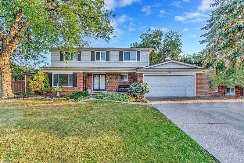
If daylight is not in a room because windows are tiny, pay extra attention to bulb warmth and brightness. If you are also choosing house paint colors outside, test on more than one side of your home. South-facing walls can brighten a shade. North-facing walls can make the same shade look deeper and cooler.
In Macomb and Oakland County, it also helps to consider seasonal dirt and winter salt near entries and driveways, especially with lighter colors.
Final Thoughts On Creating A Cohesive Color Palette
A cohesive palette does not mean every room matches. It means rooms relate, so moving through your home feels smooth. Start with a base family, then pick a couple supporting shades that repeat in small ways through textiles, artwork, or consistent trim.
If you want a faster decision with fewer surprises, a professional eye helps. Elite Paint Home Renovations provides interior and exterior painting and remodeling services.
When you are ready to get a clear plan and a free quote, contact Elite Paint Home Renovations through elitepaintcompany.com to request an estimate or consultation.